Gestalt Principles: Capturing Attention in Web Design
With the Gestalt Principles you can control your user's journey effectively with style
12th April 2024
7 min read
Kai Cockrell
Kai Cockrell is a student currently studying in London

Caption: Web Design Sketching Phase
Gestalt Principles: How to make your website look good and control attention
It is quite easy to look at a webpage, or any design for that matter, and decide you do not like it, or that it "looks bad". However, it is another skill entirely to explain why, that is where the skill and knowledge of a designer comes in. Website designers use a plethora of resources and design theories to make sure what they create is both aesthetically pleasing and contains a sophisticated user journey.
User Journey
In website design user journey refers to the path a visitor will take when exploring the site, from the landing page to other pages and potential calls of action. To control user journey a variety of techniques, often grouped as 'visual hierarchy', are employed. Many of these techniques make use of controlling the users attention, making them look at what the designer wants them to look at in the order they want them to look at. One of these techniques are called the Gestalt Principles
The Gestalt Principles
The theory of the gestalt principles has a long history, its origins are not entirely certain but one of the earliest works is Max Wertheimer's 1923 Gestalt laws of Perceptual Organization. That is to say, the Gestalt Principles go beyond just website design, they are principles of human perception as a whole.
The human brain is good at filling blanks, it can create a whole greater than the sum of its parts, but by manipulating those parts we can change what the whole image becomes. Gestalt theory is based on this idea of the human mind simplifying complex image and designs that contain multiple elements into one consistent whole. There are many principles and in this blog I will cover seven:
- Similarity
- Continuation
- Closure
- Proximity
- Figure/Ground
- Symmetry and Order
- Common Fate
Similarity
The human mind likes to find patterns and group things, this can be through a variety of attributes e.g. colour, shape, size etc. Therefore when you make things similar, even if they might not be near each other, the human mind will group them together. On the other hand if you make things dissimilar then you can create contrast and make things stand out.
In web design generally a section is more pleasing if the elements are similar. When formatting is inconsistent things tend to look disorganised and ugly. However that is not to say that dissimilarity is never used for the sake of contrast and influencing the users perception.
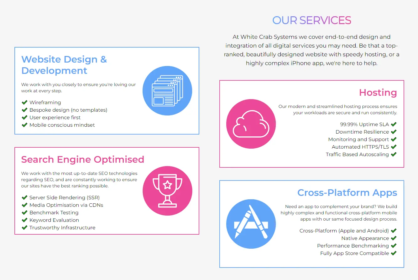
Take the "Our Services" section of our website for example. In this section similarity is used often to be aesthetically pleasing. The spacing between each service is identical, the size of each element is identical as well as the text properties. However, to avoid aesthetic boredom we utilised two separate colours of our colour pallette to distinguish the services from each other. This makes the design more interesting to look at and the contrast makes the important information, the services, grab your attention.
Continuation
Within human perception there is something called the Law of Continuity that refers to how the human eye will follow the smoothest path when viewing lines, regardless of how they were drawn or when viewing logical paths. That is to say that often despite other attributes such as colour and size, when it comes to lines the path matters more when it comes to visualisation.

To explore this more let's look at this typography example, when first looking at this image you will notice it takes a second to parse the sentence, despite the colour coding. That is because is English we read left to right top to bottom, that is the smoothest path in the continuity of the reading path. If we change this typography to the more natural path this will be clear to see.

As you can see the typography is now both aesthetically more pleasing and easier to read at a glance. This makes the user journey ore smooth.
Closure
Closure refers to the phenomenon where the brain will fill the missing parts of a design or image to create a whole. This is often seen in logo designs, for example:

In this coffee logo the lines are not actually completed in the design. But at a glance the rest of the shape is still perceived by the viewer. The design does not need to be completely filled in for the concept to be "seen".
In web design this can sometimes be used to suggest there is more to an element than what is on the screen. If an element partially leaves the screen it suggests to the viewer that they can scroll to see more.
Proximity
Proximity, as it sounds, refers to the closeness of elements. Elements are often grouped by their proximity to each other. It is often used in ux design to order and group things without having to use hard borders.

Taking another example from our website. Each complexity level of the 'Covering your needs' section has their title, tags and descriptions grouped by their proximity to each other and to the other levels. This might seem really simple but it can be surprising how often in design proximity is ignored and a webpage can seem extremely cluttered.
Figure/Ground
In the Gestalt Principles, figure/ground refers to how the brain distinguishes objects it considers to be in the foreground and background of a design. This often takes advantage of how the brain processes negative space and, for example in many optical illusions, can change what the viewer perceives to be the foreground and background to show two different images.
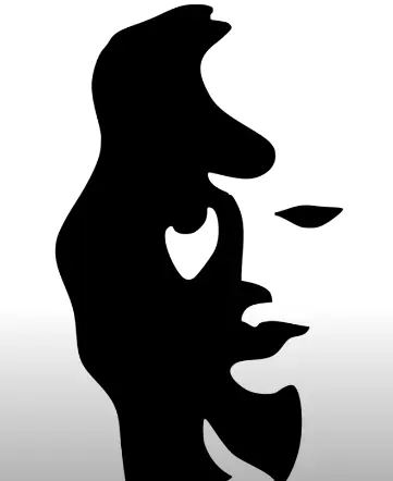
In web design this concept is often used to create a focal point on one element. A common example is when modal windows, elements that must be interacted with to continue, appear the rest of the site blurs or fades causing a foreground/background effect.
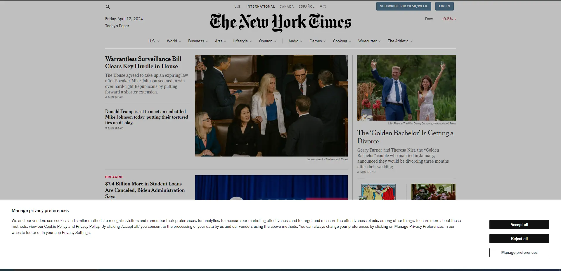
Here is an example from The New York Times website where the rest of the site is dimmed when the modal window appears drawing the users attention quickly.
Symmetry and order
This principle has two main aspects to it. The first being that the brain will perceive ambiguous shapes in the most simple manner possible. For example in the following image, even in the example without colour, you will perceive the shape as a square, circle and triangle as that is simpler than making sense of the overall abstract shape.
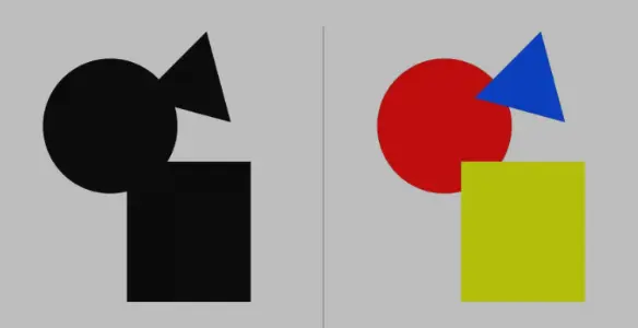
The use for this in web design is cautionary about trying to make designs that are overly complex or abstract. People's brains prefer perceiving simple and clear shapes.
The second aspect to symmetry and order is that symmetrical shapes are seen as grouped together and are aesthetically pleasing.

In this example from Apple's website you can see in the design of this element the two watches in symmetrical positions with identical tracing looks good and adds cohesion to the design.
Common Fate
The final Gestalt Principle we will outline is the relatively new Common Fate. Generally, people will group things together that point to or are moving in the same direction. For example, a flock of birds is a group of individual animals but as they move together they are perceived as one.

In modern UX design this principle is most often used with animated effects. It is also worth noting that effect do not need to actual be moving to incorporate this, just that they seem to. Having elements move away or against one another can create contrast and prevent them from being grouped together as well.
Conclusion
The Gestalt Principles are an aspect of visual hierarchy that are essential for understanding how to influence a viewers perception and user journey. They can be used both to draw your users attention where you wish it to be and make your website aesthetically pleasing. I would implore all website designers to research the gestalt principles ang get used to having a mindset in which they are incorporated. Without educating yourself on design principles all you are left with is trial and error and frustration.

Deploy Next.js on Kubernetes Step 1: Image Building & CI/CD
David Hazra
25th July 2024

Search Engine Optimization Part 1: How Does It Work?
Kai Cockrell
5th July 2024

Weights and Biases Website Design Review
David Hazra
6th June 2024

Aerospace Materials: A Journey Through Time
Daniel Bevan
10th May 2024

Visual Storytelling in Web Design
Daniel Bevan
27th April 2024

Visual Hierarchy: Controlling Your Users Focus
Kai Cockrell
19th April 2024

Linguistics and LLMs: Understanding Language
Kai Cockrell
11th April 2024

Databases on Kubernetes (Part 1)
David Hazra
10th April 2024

Inside UK Chip Designer ARM's Soaring Share Price
Daniel Bevan
19th February 2024
© 2024 White Crab Systems LTD. All rights reserved.