Weights and Biases Website Design Review
A review of the Weights and Biases website design and user experience.
6th June 2024
3 min read
David Hazra
David Hazra is a professional software developer based in London

Caption: The Weights and Biases Front Page
Introduction
Weights & Biases (aka WandB) is a leading AI developer platform trusted by many AI teams. The website's design is carefully crafted to provide a seamless and engaging experience. In this blog I'm going to investigate key aspects of its design, as highlighted by some of our other blogs.
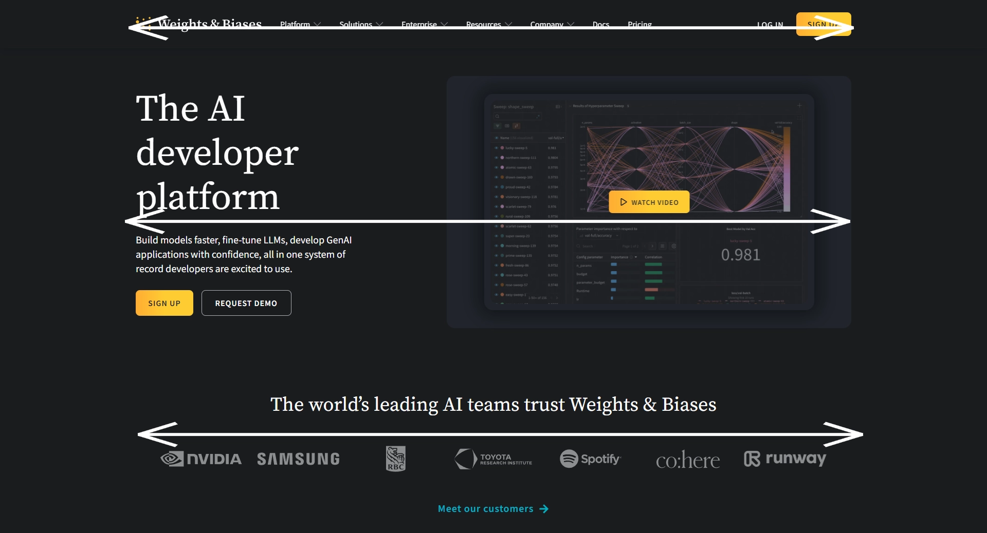
Scanning Patterns
The website follows a clear and intuitive scanning pattern. Broadly speaking the layout adheres to the layer-cake scanning pattern, which is common in web design, where users primarily scan the page according to distinct bands of information. This pattern is fairly common, and is used to provide a clean look that the user is able to read intuitively.
Effective Layout Arrangement
The layout of the Weights & Biases website is highly effective, balancing visual elements with textual information. The main sections are clearly defined, allowing users to quickly find what they are looking for. The use of grids and well-structured content blocks enhances readability and usability.
The layout is also aided by the contrasting colours to make it easy for users to find what they need, and is also visually interesting.
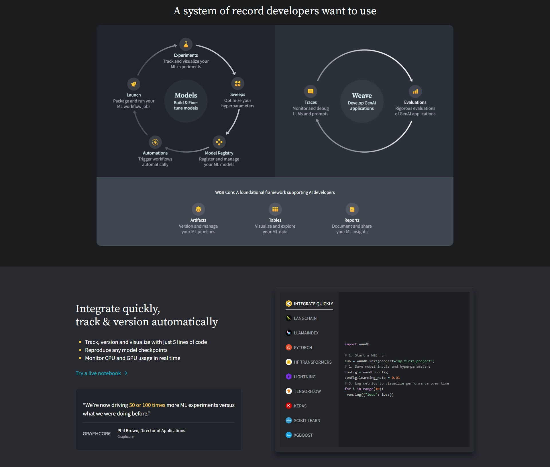
Colour and Contrast
The colours of the site are perhaps the most stand out feature, effectively using dark grays and slate colours highlighted with a clean white text. The contrast is used strategically to draw attention to important elements and create a visually appealing experience. Larger fonts and bright colours are used for headings and call-to-action buttons, making them stand out against the darker background. This helps in guiding the user's focus to key actions and information.
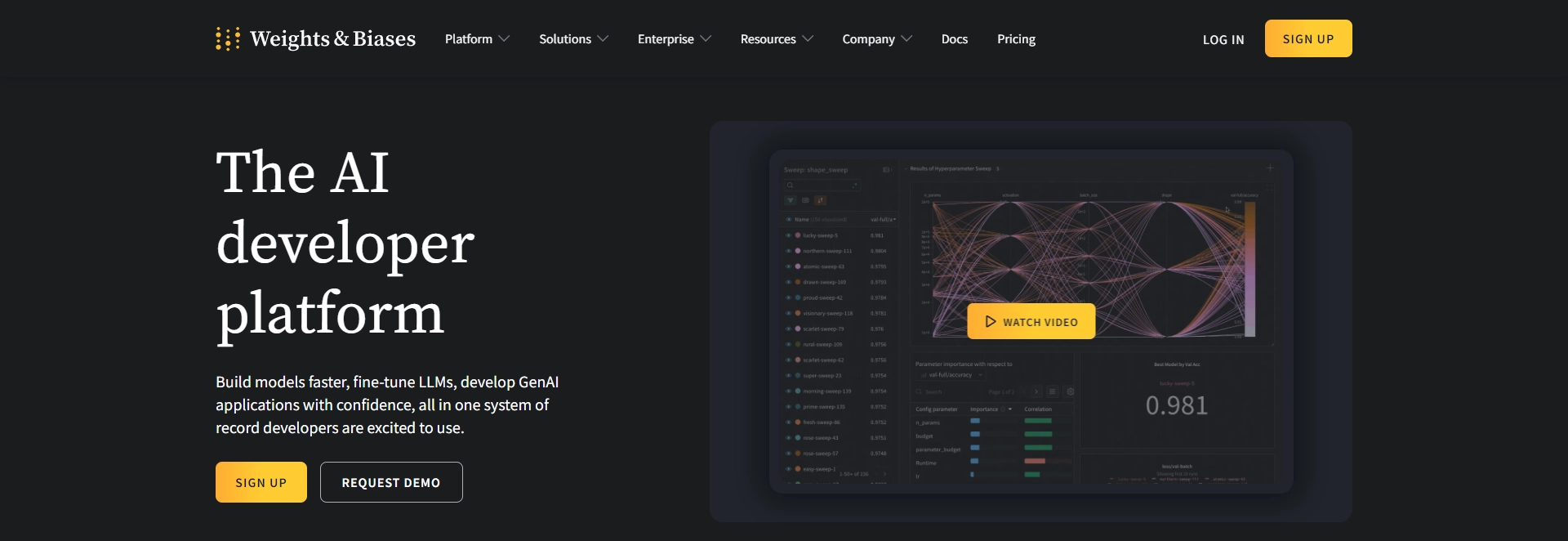
Spacing and White Space
Adequate spacing and white space are crucial for creating a clean and organised layout. The Weights & Biases website effectively utilises white space to separate different sections and elements, making the content easy to read and navigate. This approach prevents the page from feeling cluttered and enhances overall user experience.
Typography and Composition
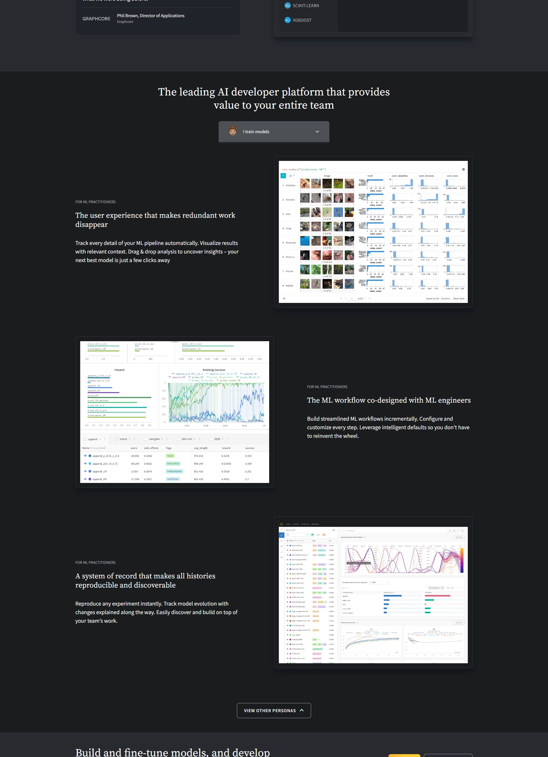
The choice of typography on the website complements its modern and professional aesthetic. Clear and legible fonts are used throughout, with varying sizes and weights to establish a visual hierarchy. The composition of text and images is balanced, ensuring that neither overwhelms the other, providing a harmonious visual flow.
Specifically the Source Serif font is used for the logo, headings, and any other big stand out piece of information. While Source Sans is used for other less stand out information.

Perspective
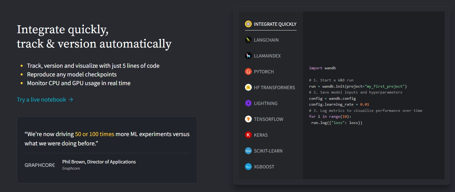
The use of perspective in the design adds depth and dimension to the website. This is particularly evident in the visual elements and graphics that create a sense of three-dimensionality. This approach not only makes the site more visually engaging but also helps in drawing users into the content.
The element that demonstrates this the most is the interactive code element.
Conclusion
The Weights & Biases website is a prime example of effective web design in the AI developer space. By focusing on scanning patterns, effective layout arrangement, size, colour, and contrast, spacing and white space, typography and composition, and perspective, the site delivers an aesthetically pleasing experience. These design principles ensure that users can easily navigate the site, find relevant information, and hopefully use their service.

Deploy Next.js on Kubernetes Step 1: Image Building & CI/CD
David Hazra
25th July 2024

Search Engine Optimization Part 1: How Does It Work?
Kai Cockrell
5th July 2024

Aerospace Materials: A Journey Through Time
Daniel Bevan
10th May 2024

Visual Storytelling in Web Design
Daniel Bevan
27th April 2024

Visual Hierarchy: Controlling Your Users Focus
Kai Cockrell
19th April 2024

Gestalt Principles: Capturing Attention in Web Design
Kai Cockrell
12th April 2024

Linguistics and LLMs: Understanding Language
Kai Cockrell
11th April 2024

Databases on Kubernetes (Part 1)
David Hazra
10th April 2024

Inside UK Chip Designer ARM's Soaring Share Price
Daniel Bevan
19th February 2024
© 2024 White Crab Systems LTD. All rights reserved.