Visual Hierarchy: Controlling Your Users Focus
With knowledge of Visual Hierarchy you can create an efficient and visually pleasing website easily
19th April 2024
8 min read
Kai Cockrell
Kai Cockrell is a student currently studying in London

Caption: Visual Hierarchy stock image
Visual Hierarchy: controlling your users focus
In the field of web design the term 'Visual Hierarchy' refers to the way information is organised and presented on a website. However, that does not mean that Visual Hierarchy = aesthetics/prettiness, it is more concerned with accessibility, flow and the 'User Journey'. That is to say that visual Visual Hierarchy is a concept of function, it is about presenting your information in a logical and purposeful manner.
It must be noted that 'Visual Hierarchy' is not a set in stone thing with set in stone contents and practices, it goes through constant innovation in order to help with achieving its main goals: informing users, communicating content relationships and creating emotional impact. Within this blog I will take you through some of the core concepts of Visual Hierarchy and its surrounding terminology and theory.
Scanning Patterns
One of the primary concepts in Visual Hierarchy is the concept of 'scanning patterns'. Scanning patters refer to how the human eye moves across a webpage, somewhat dependent on its design. In western countries/languages we read left to right and in these cultures are eyes scan the same way across a web page starting at the top left and ending at the bottom right. However, people do not read all of the information on your website, far from it, and they do not look at every inch of the screen. Generally when it comes to where people actually look there are two patterns: the F pattern and the Z pattern.
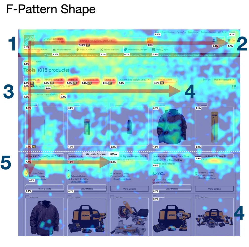
The F pattern, sometimes called the E pattern, is named as such as that is the shape they path of the eye makes down a page, see the image above for an example. The viewer will begin at the top left and move across the page, typically where the navigation bar would be placed, the eyes will return to the left and begin to move down the page, going across periodically where information is laid out.
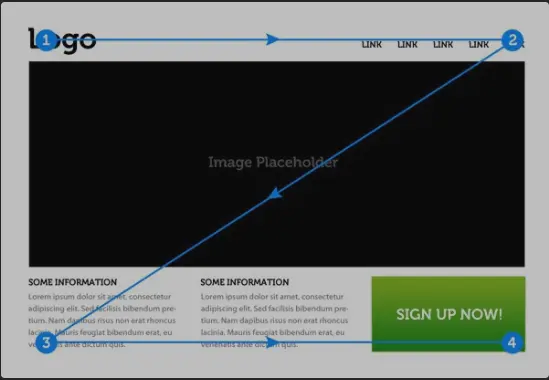
The Z pattern however is seen with landing pages that use less text, often with a large design, video or image in the center. With these kind of webpages the viewers eyes start at the top left, go across to the top right, cut down diagonally to the bottom left and go across the bottom. The reason this is important to keep in mind is that where the user is likely to look decides where you want your important content to be. For example, in a Z pattern webpage you would place your call to action button at the bottom left, as that is the end of the journey across the page. In an F pattern design you would not place important elements or content in between rows of other content as it is more likely to be missed.
Effective Layout Arrangement
With the scanning patterns in mind it is now right to talk about layout arrangement. I already briefly mentioned a couple of examples of how you can use scanning patterns to help decide layout and alignment but that is simply one tool in the arsenal of Visual Hierarchy. Another example theory that is oft used is the Gestalt Principles which describe how the human brain perceives and organises elements, to see more on the Gestalt Principles see our blog here: Gestalt Principles
In the following sections I will talk of more tools and theories but there is also some general wisdom when it comes to effective layout arrangement. You want to prioritise balance on a page, not necessarily symmetry, but balance. You want the page to be content first, aesthetics second with a structured organised layout that is easy to navigate. You do not need to reinvent the wheel, users do not want to be confused trying to figure out how to move through your site or how to find certain information.
Size Colour and Contrast
Size is one of the most obvious expects to change on an element in regard to making it stand out or draw attention. Generally more important elements should be larger not only for drawing the eye but it is also less effort to click larger elements, so for calls of action they are more effective. However, there are pitfalls to avoid when it comes to size hierarchy, you do not want to overpower a page with a single overly large focal point without good reason as you may easily compromise user usability by making the secondary content too small. Also elements being too large often can lead you with little space, this will be explored further in the white space section.
After size there is of course colour and contrast. Generally elements that have the same colour are grouped together and having differently coloured elements next to each other creates a contrast which attracts the human eye. However, general consensus is that on a webpage you do not want too many different colours as it may seem too busy or lack a consistent aesthetic. Our advice is to stick to one or two primary colours, secondary colours and an accent colour. This will provide you with enough variation for grouping and contrast but will allow consistency.
Spacing and White Space
Something that is often ignored when ti comes to web design or design in general is use of negative (or white) space. When content is too close together consistently on a page or the entire page is covered by elements it provides a claustrophobic feeling, diminishes the ability to guide the users eye through contrast and makes the user journey overly difficult and confusing. White space itself can be used aesthetically and to guide the eye. Look at the example from the homepage of our website below.
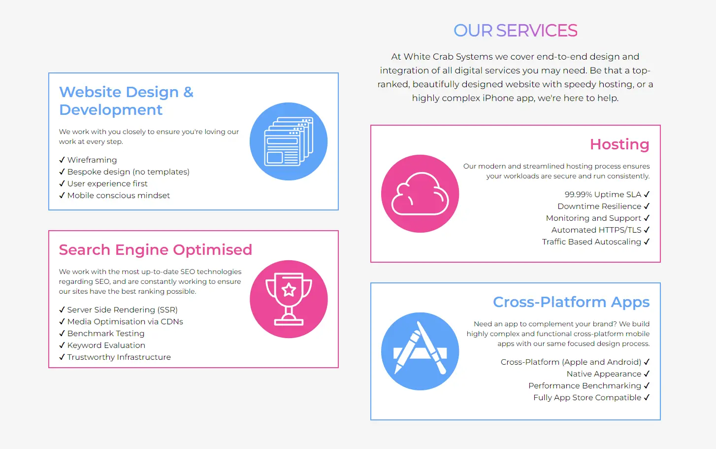
In this section of our homepage the spacing of the elements creating a ladder effect guides the users eye down the page and the negative space between each elements distinguishes them from one another and helps the eye focus on one at a time. This is only one, quite basic, use of negative space and spacing, there are other more artistic avenues to its usage as well. However, the main point being made here is that you need to incorporate negative space on top of used space as tools to create an effective web design, do not only think of where something should be but also where it should not.
Typography and Composition
Moving on to two other areas of Visual Design there is the matter of typography. I could make an entire other blog on typography alone, and may do in the future, so I will keep it simple here. For effective Visual Hierarchy generally you need to think of all elements to the text on your page, from the font family to the size to the emphasis as well as how it interacts to other text and elements around it. You need to emphasize the text you want your users to read the most or th text you want to make a strong impression with. Looking back at the image from the previous section we use size to designate headings so the suer can quickly scan for the information they are looking for, we chose a font that is easy to read and aesthetically pleasing while remaining professional and contrasted colour to make the elements pop.
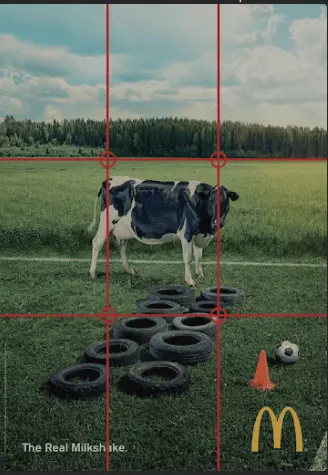
Proceeding to composition I wish to outline two concepts within composition that are easy to employ in web design, the thirst being the Rule of Thirds. In design the rule of thirds is a method to create a balanced composition, it divides layout into a grid in which the focal point moves away from the center to a few areas around it, see image below, it is generally visually appealing due to its harmonious aesthetic.
The second concept is the Rule of Odds. Less well known than the Rule of Thirds, the Rule of Odds refers to how the human brain prefers to see an odd number of object than an even number, therefore you generally want to have the focal point surrounded by two to four other elements. Look at the image below to see how this looks.

Perspective
The last concept I will explore in this blog is that of perspective. Generally websites are designed for flat surfaces, monitors and phones, and thus designs are typically 2 dimensional but by playing with perspective you can help control focus and determine what is important in your design. The three typical ways you can effect perspective is: changing size of elements compared to the elements surrounding it, a parallax motion where an element moves slower or faster than moving elements around it and adding drop shadows over a background layer.

This blog does not encompass every concept, theory and tool present in Visual Hierarchy. But I hope it was a semi-comprehensive and understandable starting point for your further research into website design. Visual Hierarchy is important to understand as without a mindset that encompasses these ideas you will only be working off of guesswork to make things "look good" but through research and practice you can save yourself time and effort while providing a better experience to your users.

Deploy Next.js on Kubernetes Step 1: Image Building & CI/CD
David Hazra
25th July 2024

Search Engine Optimization Part 1: How Does It Work?
Kai Cockrell
5th July 2024

Weights and Biases Website Design Review
David Hazra
6th June 2024

Aerospace Materials: A Journey Through Time
Daniel Bevan
10th May 2024

Visual Storytelling in Web Design
Daniel Bevan
27th April 2024

Gestalt Principles: Capturing Attention in Web Design
Kai Cockrell
12th April 2024

Linguistics and LLMs: Understanding Language
Kai Cockrell
11th April 2024

Databases on Kubernetes (Part 1)
David Hazra
10th April 2024

Inside UK Chip Designer ARM's Soaring Share Price
Daniel Bevan
19th February 2024
© 2024 White Crab Systems LTD. All rights reserved.